top of page

Designing Mixed Reality Training Session
Factory floor operator training, in handsfree immersive VR experience.
Client
Dozuki (i-fixit parent company ) developed a platform, suitable to be used with tab/desktop for 3M workforce with consice textual instructions paired with clear visual cues as work instructions, training sessions, quality check, data collection and report generation. The primary ask was to convert a specific training scenario from screen based interaction to mixed reality based session.
Timeline
8 Months, Corporate Project
My Role
User Experience and Interaction Designer
Deliverables
Research and Concept Generation, Defining Process for MVP, High Fidelity Mockup of Home Screen.
KPIs
Microsoft Hololens 2
Unity MR Toolkit

PROBLEM
Factory workfloors are mostly centered around physical presence of the employees which got majorly affected after onset of pandemic. Production plants felt urgent requirement of remote collaboration for technical guidance, supervision, sampling and trainning on physical equipment and products to mitigate the incresing number of complexities.
Technology gave advantage to people for connecting remotely but in reality factory operators were still facing issues in complex situations regarding collaboration with vendors, customers, coworkers, Tech.SMEs etc. to accelerate existing procedures related with trainning, report generation and on-spot problem solving.

What if, we could recreate and optimize the screen based trainning platform to scene based experience, so that factory operators can feel like they are always in touch with required team/person globally and attain faster results with real time hands-on work.


Designing Mixed Reality Training Session
Factory floor operator trainning, in handsfree immersive VR experience.
ON
BOARDING
Augmented Reality User Training -
DESIGN
STAGES
Research
User Analysis
Ideation
LIMIT
ATIONS
Bound to Brand/
Company Guidelines
Used by a closed
group (15)
Cost Flexibility
Unavailability of relevant use case
Understanding Interactions of Mixed Reality
Unity Mixed Reality Toolkit
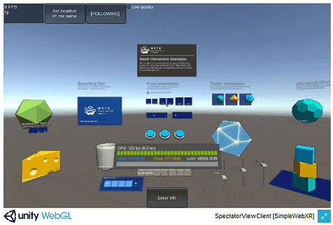
MRTK is a Microsoft-driven project that provides a set of components and features, used to accelerate cross-platform MR app development in Unity. It supports Hololens & Hololens 2, OpenVR, Ultraleap, Mobile devices and Web XR.
MRTK’s primary focus is to make it extremely easy to get started creating Mixed Reality applications and deployment to multiple platforms from the same Unity project.

Unity Mrtk
With WebXR capabilities the following functions: Controller Tracking, Hand Tacking, Hand Ray, Index Pointer, Grip Pointer, Spatial Pointer and Teleportation can be added to MRTK for browser based apps.
The Hand Menu is one of the most unique UX patterns in HoloLens 2. It allows you to quickly bring up hand-attached UI. Since it's accessible anytime and can be shown and hidden easily, it's great for quick actions. It is different than Near Menu which provides a collection of buttons or other UI components, floating around the user's body and easily accessible anytime with 'Pin' button to world-lock/unlock the menu.


HoloLens 2's shell-style button with backplate supports various visual feedback such as border light, proximity light, and compressed front plate.
For collider based buttons, it is recommended to use it with an opaque backplate. Transparent buttons are not recommended because of the below usability and stability issues:
- Icon and text are difficult to read with the physical environment.
- It is hard to understand when the event triggers.
- Holograms that are displayed through a transparent plane can be unstable with HoloLens 2's Depth LSR stabilisation.
Microsoft Hololens 2
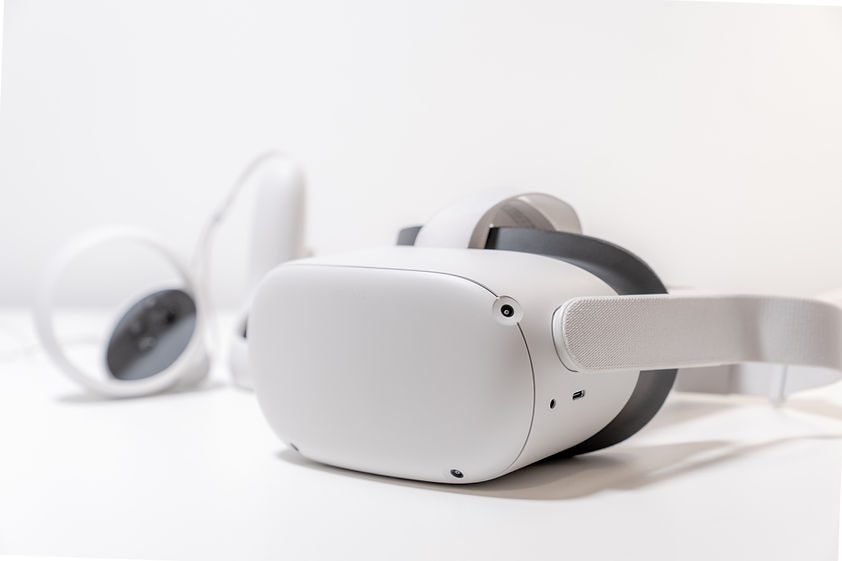
Handsfree Head mount Device for Immersive VR Experience.
We needed at least one device to test our concepts and to complete VR Training for selected factory floor operators.
3M’s Partnership with Microsoft helped with this bottleneck and they provided us with Hololens 2 device to take the venture forward.

MS Hololens 2
Research
As no separate UX Researcher was appointed for the task, I did primary qualitative research and requirement gathering at the discovery phase of the project. It took around 3 weeks to gather the inputs as per onsite availability of interviewee and couple of more days to document the findings. I managed to conduct 4 user interviews because of IST - EST overlap and majorly due to stakeholders unavailability but later gathered more insights from Adam who is a veteran in AR/VR domain.
Primary Qualitative Research:
User Interviews - Some of the key questions that were asked:

Primary Research
Requirement Gathering:
Prior to User Interviews - Some of the key requirements were provided by business:

Post User Interviews - We identified couple of more important requirements:

Req. Gatering
User Analysis
By focusing on the right metrics engineers, developers, and designers can track how users engage and interact with their software, product or application in an attempt to improve the experience of end product. It relates to better decision making, design changes, new/updated features and onboarding strategy therefore by bringing in end users eventually results in refined user engagement with the product, and the general success of the product or application.
Persona & Empathy Mapping:
Here 2 interviewee personas are shown to highlight some of the key points:


Persona & Empathy Map
Key Insights:
Some of the identified pain points:

Key insights
Ideation
We received a preliminary idea from 3M's KT session about the existing training screen. After going through user research, understanding the business ask and end user requirements from a high level,
I was able to provide iterative sketches to convey team what layout we should move forward to.


Screen Based Changes:
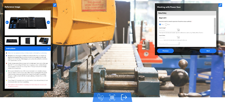
Three different content types were Identified on the screen -
1. Media Container (Reference Image or Video File)
2. Instruction Container (Higlighted Textual Information)
3. Input Container (Feedback from Operator)
I tried to split Media Container from rest two for better understanding of content in virtual reality environment and we decided to go with an early mockup with combined Instruction & Input Container.
Story Boarding:
The conceptual sketches captured the idea but conveying the same to developer was tricky.


As a way around, I used Reality Sequence Template to capture the interaction. It helped us to keep track of the user s input applied to the current scene.

Storyboard
User Flow
As per project requirement Upload path remained out of scope and ‘QR Code' trigger was taken into consideration:

User Flow
Design Dev Handover
As per business decision we moved with early iteration of screen to scene based interaction.
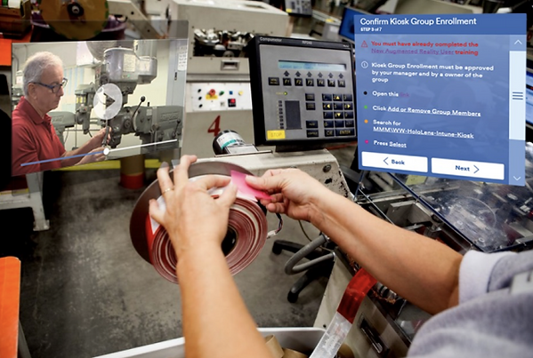
The following video shows Marker Based (QR Code) Kiosk Enrollment and screen based training session opned via browser.
QR Kiosk Enrollment Video
Usability Testing:
After getting the first protoype in allignment with concept, we decided to share it with Andrew (Designer) and Chris (factory floor operator) to get quick feedback from onsite.

The above mentioned session was recorded. Later it was analyzed and documented as per observations made, feedbacks captured from both sides and refined via remote user testing.
Feedback 1
"Combining User Input with textual instruction created problem as the container became overloaded with information and operator need to shift gaze repeatedly.”
Solution:
Separated instructions from Input container and attached with Media container.
Observation:
Operator now finds it easier to follow instructions by referring from above image/ video, rather repeatedly moving gaze from right shoulder to left shoulder.
Feedback 2
"After spending sometime in training session left hand side media & instruction container seems visually heavier than, right hand side input container.”
Solution:
Introduced single accordion to hide textual instructions.
Observation:
Operator now finds it convenient concentrating on reference image or video and if required can hide long textual instructions.
Feedback 3
"In factory bay areas with where there are large skylights installed, the overlapped containers whites out and various visual feedback such as border light, proximity light makes it even more harder to see."
Solution:
Provided black and partially transparent bounding border with opaque buttons.
Observation:
It has reduced the whitening to some extent and screen seems to be retaining it s readability. But this problem is not solved entirely
Feedback 4
"Containers are getting skewed in presence of uneven/circular surface and people loosing track of them in VR environment."
Solution:
Incorporated Follow Me icon in Near Menu and introduced Pin feature to left & right hand container while placing the containers at 90 degrees with floor.
Observation:
These features made the operators really satisfied as now they can move and work hands free, without worrying about the containers getting lost
Home Screen Mockup
After a successful login and authentication, user can experience full immersion through the head mounted HoloLens 2 device:

Shout out:
In June 2021 HoloLens Project got featured in 3M News. It was majorly the MVP what our team delivered to the client, but I personally would have been more happy to work and observe the final product which eventually was used at 3M respirator production plants.
"3M plans to continue using the HL2 headset, even when travel restrictions are loosened. The technology is a key communication tool to effectively collaborate, troubleshoot and interact on a global stage” - Adam.
Home Screen Mockup
bottom of page


